

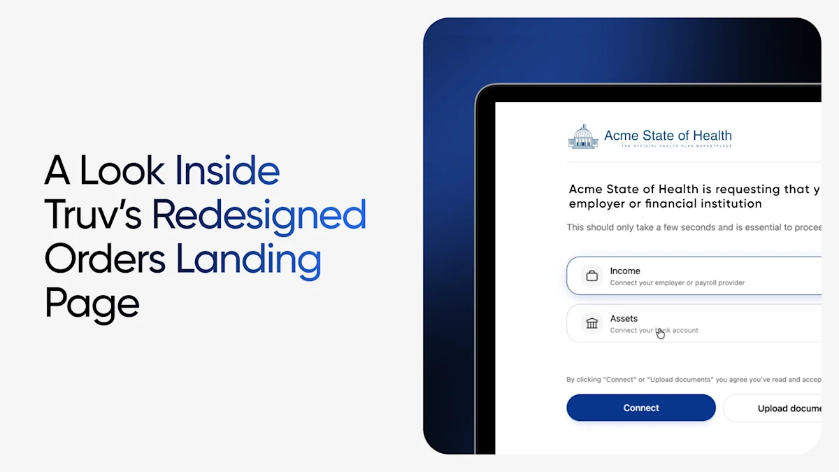
The page every applicant sees has been rebuilt from the ground up, going live September 1, 2026.
For most borrowers and end users, the Truv orders landing page is the first impression. They don't see your dashboard. They don't see the API calls, the payroll connections, or the report that lands in your team's hands for review. They see one page, arrived at from an email or a text message, asking them to connect income sources, bank accounts, and, for public sector, education verification.
The landing page is where a high-intent end user either completes account connections in just a few minutes — most orders that convert do so within the first two hours — or hesitates, closes the tab, and becomes a reminder sequence, then a follow-up call, then a manual fallback.
Which is why we rebuilt it.
What changed
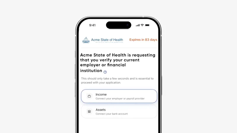
Built for the mobile experience
- A defined mobile header replaces the improvised top of the old page, so end users know whose request this is and what they're being asked before they scroll.
- Static action buttons. The primary action stays put and stays reachable instead of scrolling out of view, ensuring that an end user who has made a selection is never left on a screen with no visible next step.
Clearer guidance for end users
- Short product names with a defined sub-header. Each account connection option now leads with a short name and carries a plain-language second line describing what it actually requires — connect your employer or payroll provider, connect your bank account. The choice becomes about what the end user has, not which category they belong to.
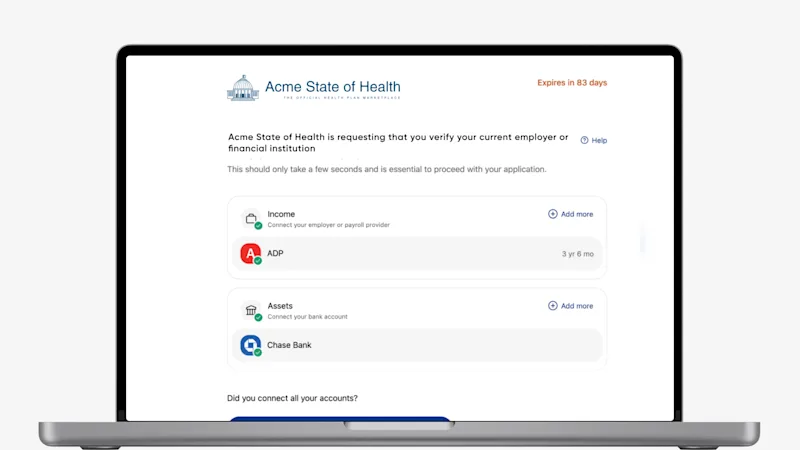
- Add more accounts without restarting. Each product now has its own action — Add more on desktop, Add on mobile — that opens the bridge for that product type specifically. End users with two jobs, a W2 plus gig income, or income across several sources can add each one in place rather than backing out and starting over.
- Employment role shown per employer. Once connected, each employer displays the role held there, so applicants can confirm at a glance that they connected the right account, and so you receive fewer verification errors.
- A default path is marked. A Priority product can be assigned as the primary product to connect in Truv Templates. If most of your end users connect one data source more than the other, or you always require one, the indicator guides them.
Feedback that arrives where the problem is
- Inline error messages. Errors now display at the point of failure rather than at the top of the page. Someone who mistypes or hits a provider issue can see what went wrong exactly where it happened.
- A clear completion indicator. There is now an explicit prompt confirming when the end user is done connecting all accounts.
- Action-oriented button copy throughout. Every button says what will happen when it's pressed. "Agree and verify" — which led with the legal act rather than the outcome — has been replaced with copy that names the next step. Consent language still sits directly above the button, unchanged in substance.
Fits your environment
- Consolidated help on desktop. Two competing links, "How it works" and the FAQ, are now a single Help entry point. One place to look, one fewer decision that has nothing to do with completing the verification.
- No duplicate branding when embedded. If the order is embedded in your own portal, the Truv logo no longer appears on the landing page — the applicant is already inside your branded experience, and the page shouldn't compete with it.
Accessibility standards
The orders landing page remains Section 508 compliant, including keyboard and screen-reader navigation. The redesign was built to uphold that standard for public sector clients.
We simplified the landing page without removing critical components. None of this changes what the page does. Orders still create the user, generate the bridge token, and produce a personalized page in one step. Your customization templates, branding, custom text fields, and reminder cadences all remain intact.
The results so far
In early A/B testing, the redesigned page shows measurable impact on the end user experience and conversion.
- +11.0% end-to-end conversion
- +10.4% order landing page open-to-login attempt
What this means: The new page is resulting in more end users starting to log in to Truv. Almost all of that extra volume results in a completed order.
Each one of those is a reminder email not sent, a phone call not made, a manual fallback not opened, and an application that moves a day or two faster.
The compounding matters more than the headline number, because conversion at the landing page is upstream of everything else.
Why now
The landing page has accumulated changes and real client feedback: new products, new categories, accessibility work, new tags, and more. Now, this redesign is less about adding capability and more about an intuitive stepping stone to more account connections.
Availability
General availability: September 1, 2026. On that date, the redesigned page becomes the default for all orders. No action required on your end, and no changes to your existing order links, API calls, or templates.
Pilot access: available now, on request. If you'd like to move earlier, your Truv account team can enable the redesigned page for your account ahead of the September date.
To request pilot access, or for more details, contact your customer success manager or technical account manager.


